There are these corners of the computing world that sort of jump out at me now and then because they’ve been around forever, seem immune to whatever is the current sensibility and feel very much to be products of their own … thing, whatever that is.
Like, all the Emacs themes that have been around for as long as Emacs has had themes – since Emacs 20? They have sort of odd names, and you get this sense that a lot of them predate the sort of web-driven popularization of color science. Like, someone thought it’d be cool to make a theme where everything is just a shade of blue, and call it “Dreams of Blue,” or “poindexter-blue” or what have you. There’s also some primitivism or nostalgia. The ones that are meant to remind you of amber monochrome monitors. Or WordPerfect 5.
They predate stuff that to my mind is sort of modern and seems scientific – Solarized and Dracula jump to mind, and catppuccin is big lately. Or the things that have come out of the UX departments at big tech companies, like all the variants on Material. You know where Material is coming from, because Google probably issued a press release about it to draw attention away from its latest EU privacy violation settlement.
Anyhow, there are a bunch of them and I’ve been seeing them around forever, and sometimes they do things that strike me as perhaps quaint. Like, they use a shade I’ve come to think of as “commit pink” or “commit green,” dowdy shades that predate modern sensibilities … that perhaps don’t have the whiff of scientific soundness. Tones and choices that do a little more to introduce a sense of structure than is currently popular.
At the same time, there’s this unmistakable aura of authority just because they’ve been around forever. Or at least I feel like I’ve been scrolling past them forever. And core to Unix culture is that crushing deference to the patriarchs. The same thing you feel when you learn about man pages for the first time and it begins to occur to you that it took a lot of people a very, very long time to write that much documentation. The fact that so much of it is written in a sort of assumptive, referential style just adds to the sense you’re reading the day journals of an obscure contemplative order.
Which brings me to Leuven, which I read about because someone on reddit asked for a good starting point for themeing org-mode, but which I feel like I have been seeing around forever.
Ordinarily, not my thing:
- It’s a light theme. I thought I was all in on dark ones.
- It’s sort of contrasty. I thought I wanted low contrast ones.
- Not exactly a contemporary palette. I’m not sure how to describe the modern emphasis on things that are both vibrant and low contrast – or maybe I just did by typing that. Leuven doesn’t do that.
- It draws lines and boxes around things, in a way that feels sort of like when someone writes a console app that has an ASCII GUI. It uses background colors for headings and spelling errors.
But all of that adds up to something that makes some kind of sense to me.
Like, a lot of modern themes go to words like “soothing,” posing that contra things like “strain,” or “fatigue.”

Leuven.
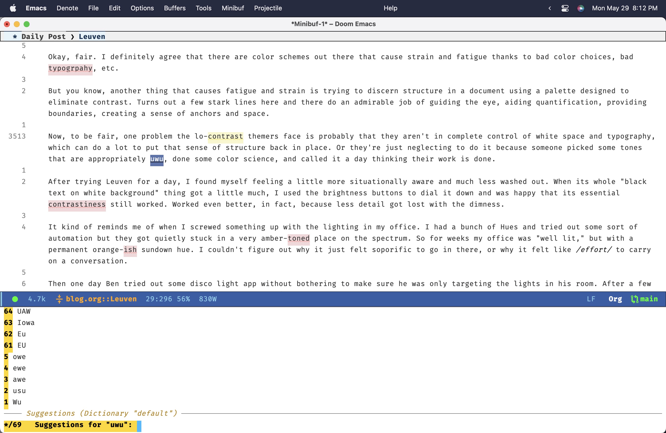
Okay, fair. I definitely agree that there are color schemes out there that cause strain and fatigue thanks to bad color choices, bad typography, etc.
But you know, another thing that causes fatigue and strain is trying to discern structure in a document using a palette designed to eliminate contrast. Turns out a few stark lines here and there do an admirable job of guiding the eye, aiding quantification, providing boundaries, creating a sense of anchors and space.
Now, to be fair, one problem the lo-contrast themers face is probably that they aren’t in complete control of white space and typography, which can do a lot to put that sense of structure back in place. Or they’re just neglecting to do it because someone picked some tones that are appropriately uwu, done some color science, and called it a day thinking their work is done.
After trying Leuven for a day, I found myself feeling a little more situationally aware and much less washed out. When its whole “black text on white background” thing got a little much, I used the brightness buttons to dial it down and was happy that its essential contrastiness still worked. Worked even better, in fact, because less detail got lost with the dimness.
It kind of reminds me of when I screwed something up with the lighting in my office. I had a bunch of Hues and tried out some sort of automation but they got quietly stuck in a very amber-toned place on the spectrum. So for weeks my office was “well lit,” but with a permanent orange-ish sundown tint. I couldn’t figure out why it just felt soporific to go in there, or why it felt like effort to carry on a conversation.
Then one day Ben tried out some disco light app without bothering to make sure he was only targeting the lights in his room. After a few perplexed seconds of figuring out what had happened (it wasn’t that hard – we shared a wall and the lights started going bananas just after he started blasting a Sophie album) I got into the Home app and reset all the lights to the tone I’d set as “normal” years ago, and immediately felt the difference.
So, Leuven. Seems to have been around forever. I thought it was going to be a bit much, but actually find it to be … bracing. Energizing.
In a similar vein, Prot’s modus-vivendi and modus-operandi themes.